HERBAL ASPECT
Brand Design Manager & Creative Lead — 2022-2024
Delivered: Brand Identity · Packaging · Product Photography · Retail Displays · Apparel · Campaigns · Product Development
Herbal Aspect is a cannabis retailer where I worked across brand design, product development, retail, and creative production. My role covered everything from packaging and product photography to apparel, campaigns, physical installations, event materials, and new product launches.
Rather than documenting every aspect of that work, this project focuses on three leading product categories that I redefined visually: flower, gummies, and seltzers. I also show how I approached packaging, photography, and brand consistency across different formats and customer experiences.
The Challenge
Herbal Aspect offered a growing range of products across multiple categories, but each product needed to feel distinct while still looking like it belonged within the broader brand image. Packaging also had to function across different formats, production requirements, retail environments, and customer touchpoints while remaining cohesive.
The Solution
Working across brand design, product development, and creative production, I developed packaging and supporting visuals for a wide range of products and campaigns. This case focuses specifically on the packaging and photography of its top three selling product categories: flower, gummies, and seltzers.
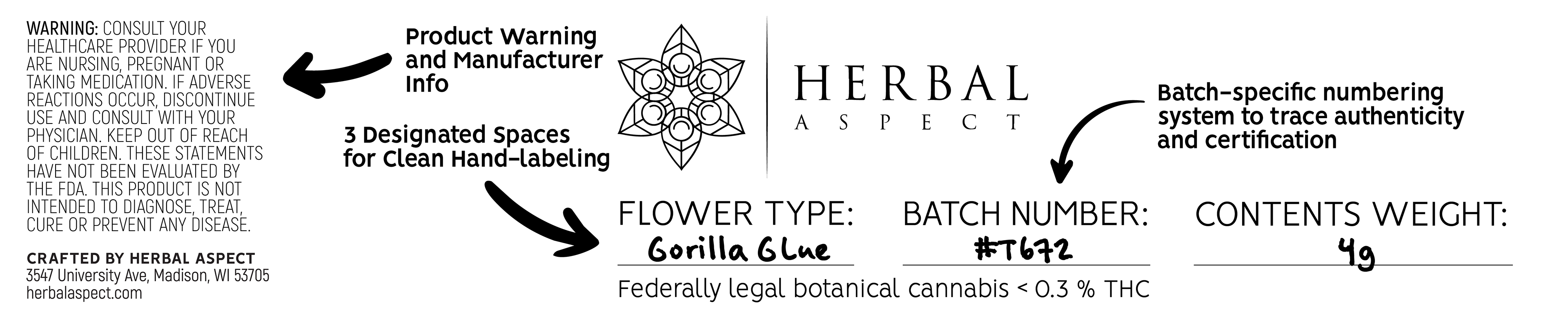
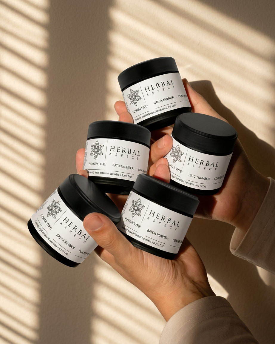
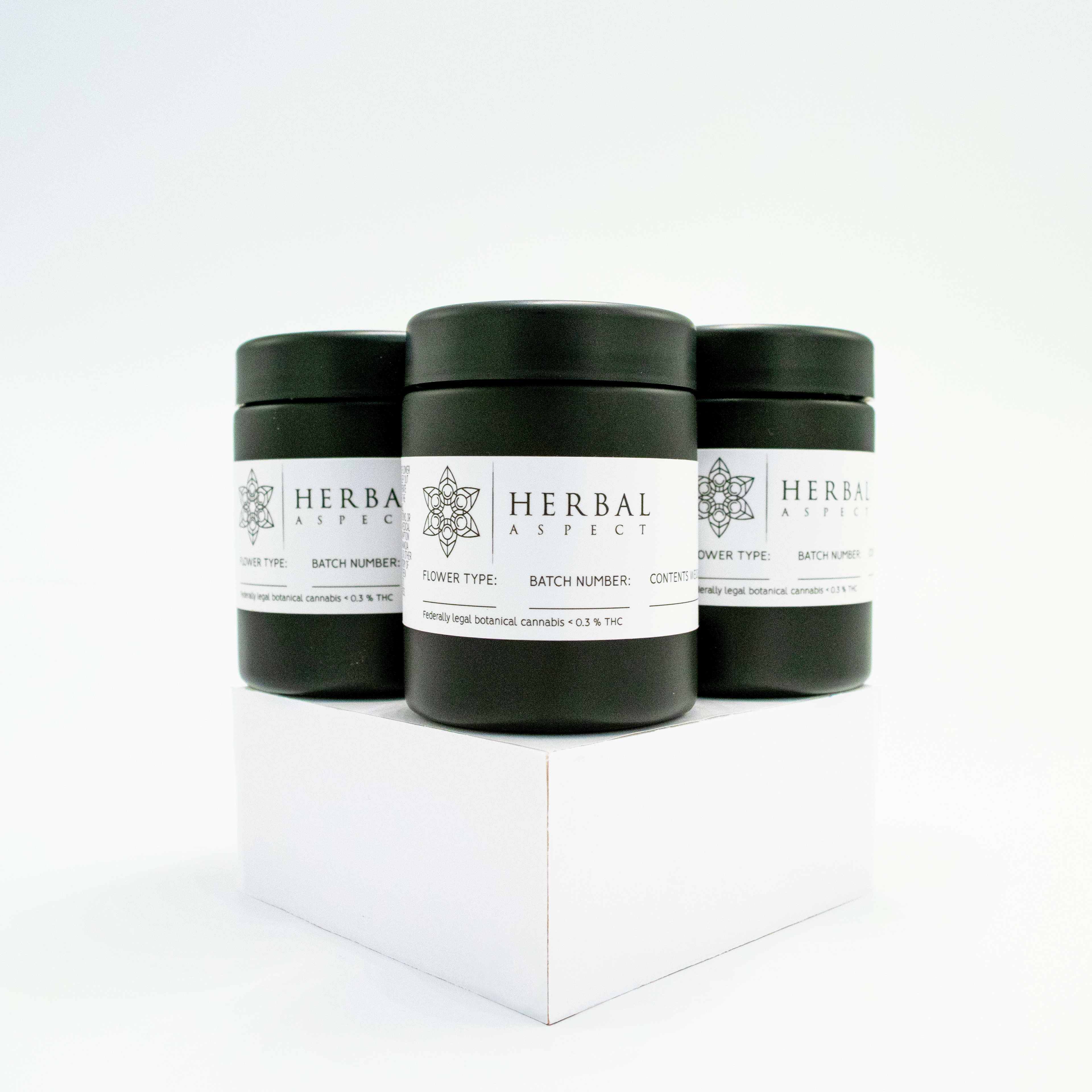
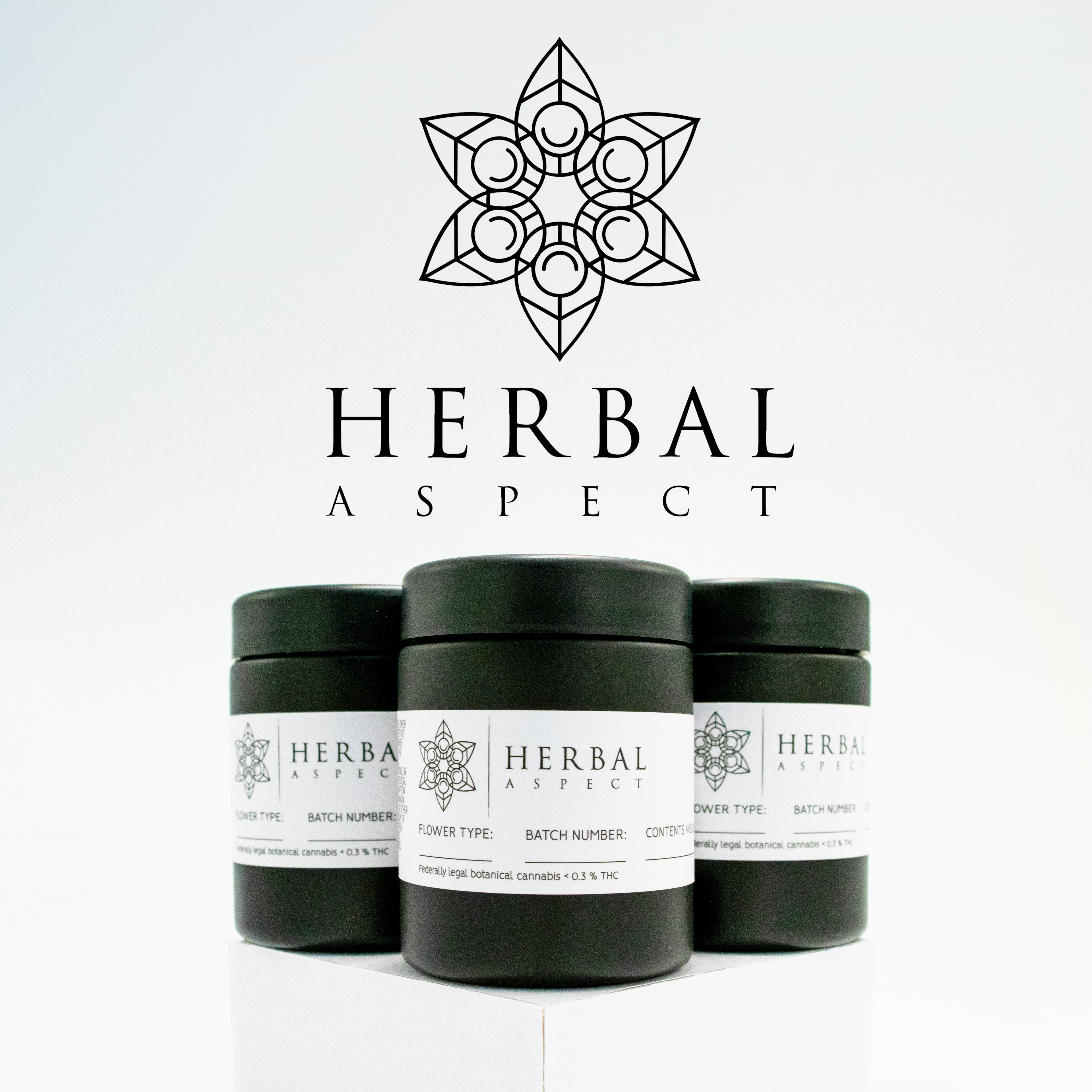
The flower jars were changed from clear to blackout to maintain freshness while also allowing online promotional imagery that followed platform guidelines. The label for the flower jar also projected a clean and credible appearance with minimal need for hand labeling.
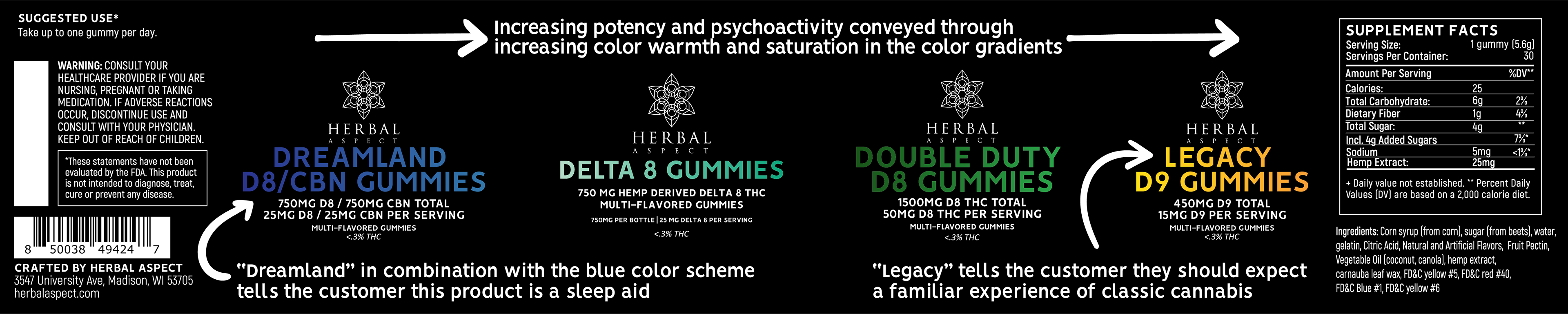
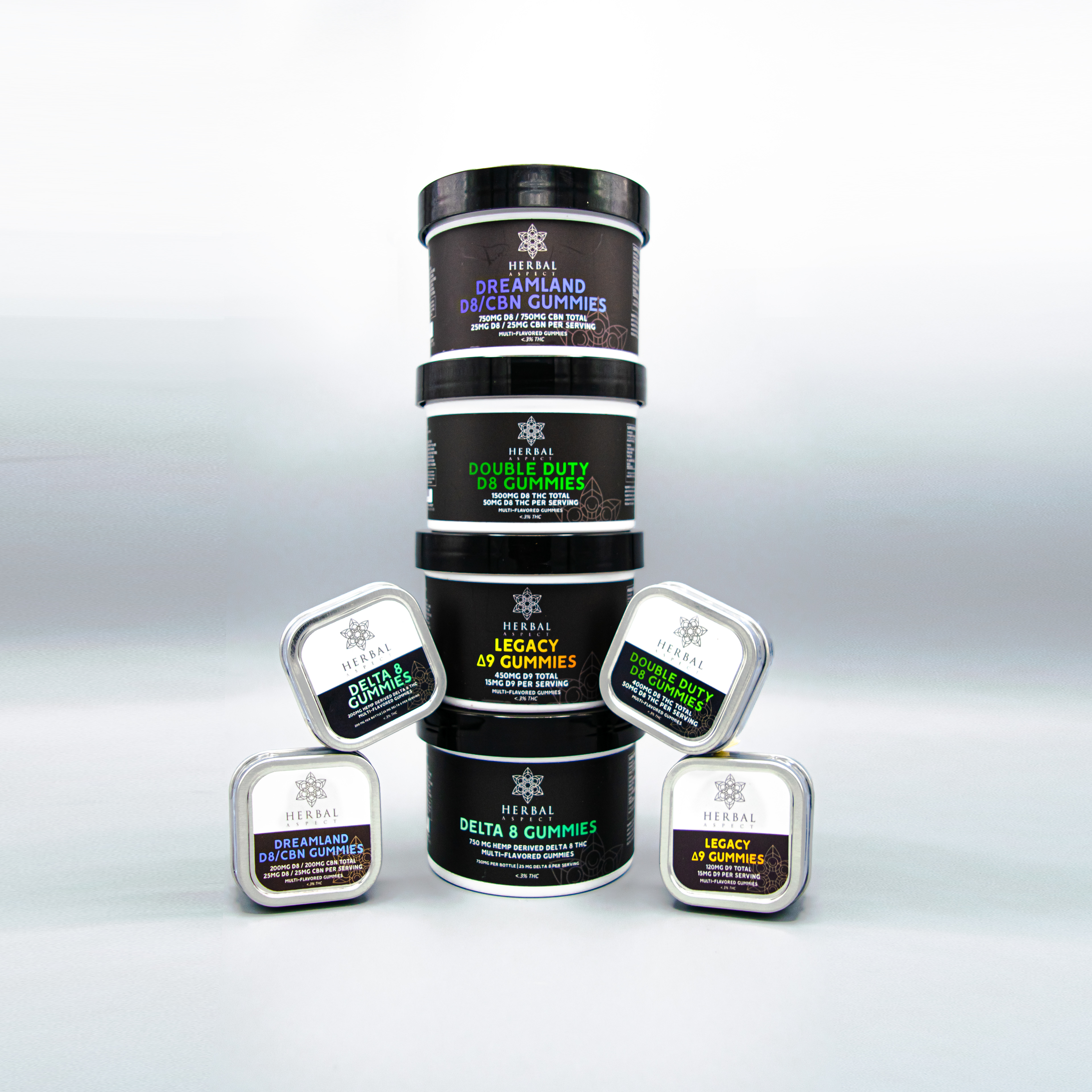
The gummy line used a consistent label structure to maintain cohesion, while unique accent colors distinguished each variation at a glance and encoded the effects of each product into the color identity.
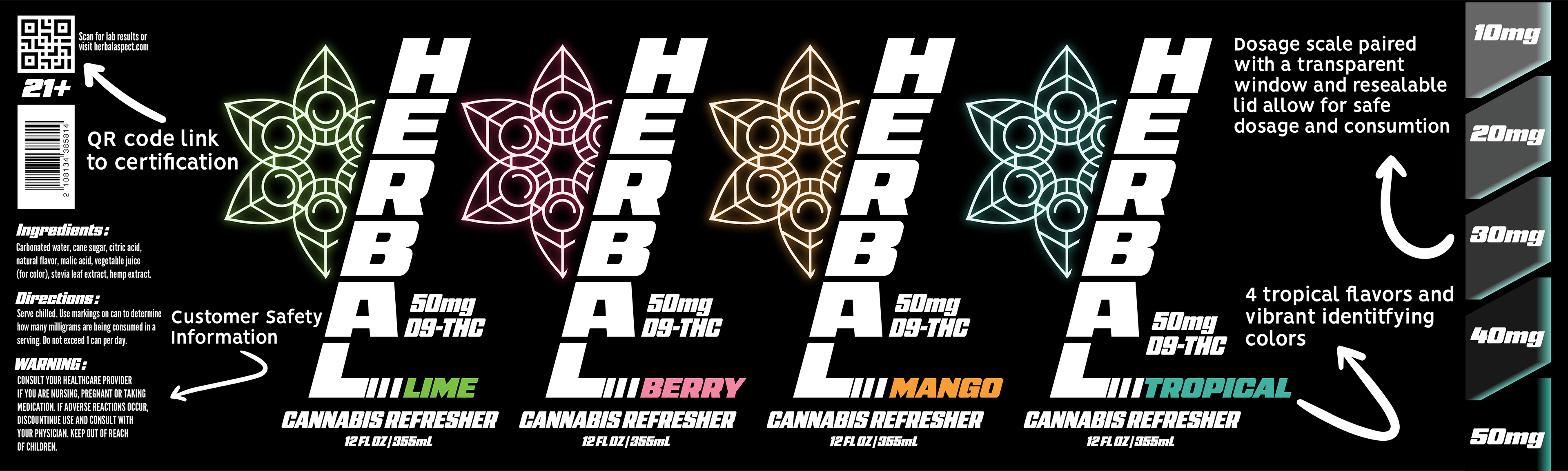
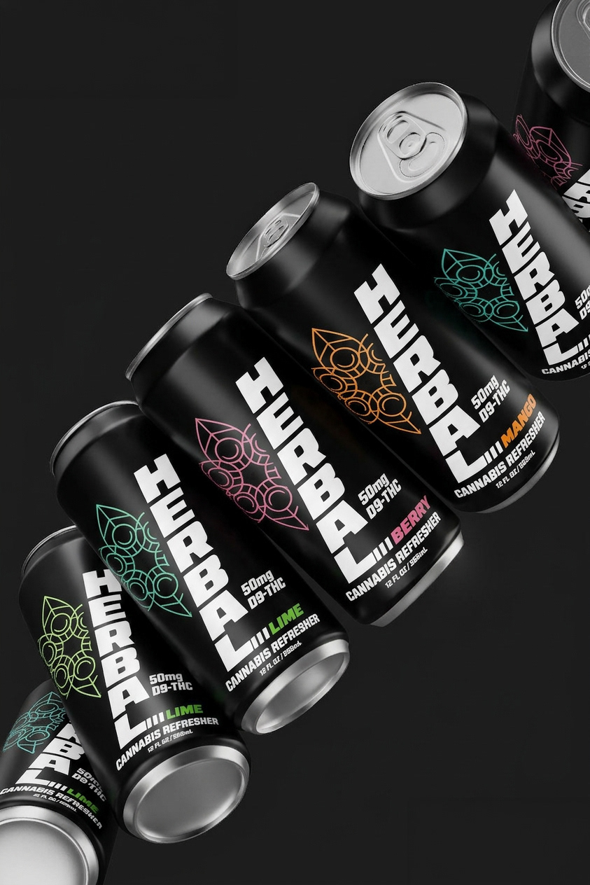
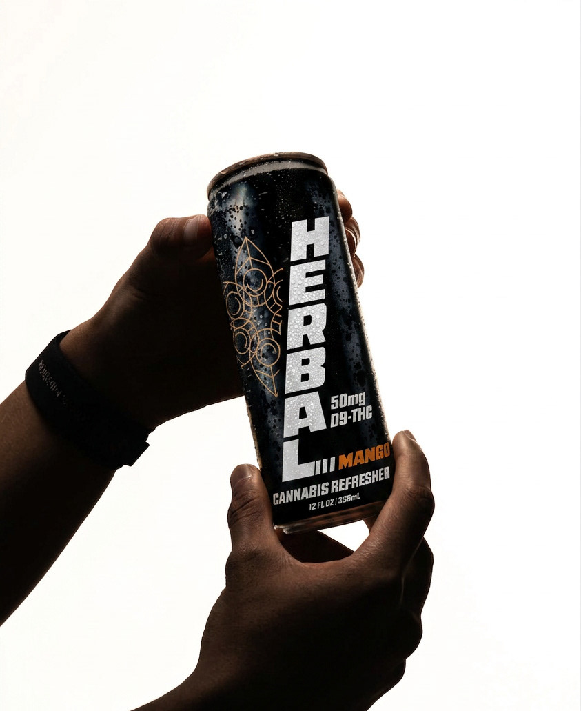
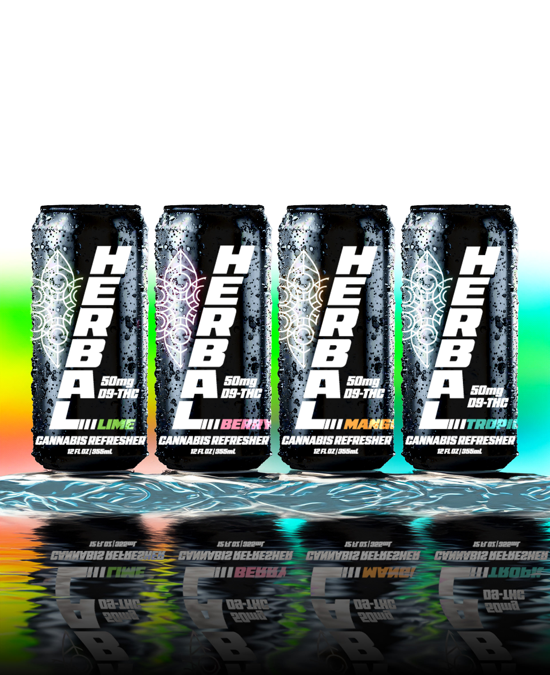
Seltzers were the fastest-growing segment of the market that Herbal Aspect had not yet begun manufacturing its own product in. I sought to change this with Herbal Refreshers. With four tropical flavors and sleek black-and-white packaging on tall cans, Herbal Refreshers were designed to stand out in the fridge among other seltzer brands.
The Results
The work created a more cohesive visual relationship between products that differed significantly in format and customer experience. Across jars, packaged edibles, and beverages, the system allowed each category to establish its own character while remaining recognizable as an Herbal Aspect product.